Chapter 6 Forecasting
So, we’ve got a time series dataset… but what is a reasonable forecast for how it might behave in the future?
Sure we can build a confidence interval (as we learned in the previous chapter) and figure out a reasonable value - but what about forecasting for multiple periods into the future?
That’s where we need to build models. Let’s load in some packages.
# Load in required packages
library(tidyverse) # Includes ggplot2, dplyr, purrr, stringr, etc.
library(ggridges) # For ridge plots
library(forecast) # Time series forecasting
library(ggrepel) # For better text label placement
library(viridis) # Color scales
library(readxl) # Excel file reading
library(lubridate) # Date and time manipulation
library(gapminder) # Gapminder data for examples
library(ggalt) # Additional ggplot2 geoms
library(scales) # Scale functions for ggplot2
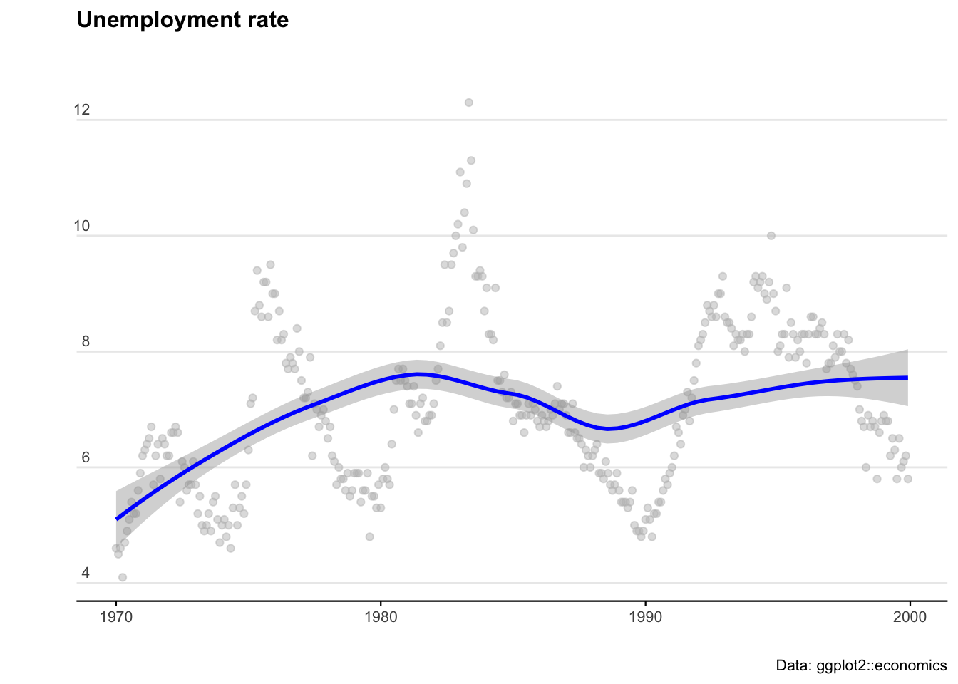
library(readrba) # Get aus econ data We’ll start with some pre-loaded time series data. The ggplot2 package includes a data set called ‘economics’ that contains US economic indicators from the 1960’s to 2015.
econ_data <- economics %>% dplyr::select(c("date", "uempmed"))
econ_data <- econ_data %>% dplyr::filter((date >= as.Date("1970-01-01")
                                          & date <= as.Date("1999-12-31")))
As a side note: We can also get Australian unemployment rate data using the readrba function.
Let’s plot the US data to see what we are working with.
ggplot(econ_data) +
  geom_point(aes(x = date, y = uempmed), col = "grey", alpha = 0.5) +
  geom_smooth(aes(x = date, y = uempmed), col = "blue") +

  labs(title = "Unemployment rate",
       caption = "Data: ggplot2::economics",
       x = "",
       y = "") +

  theme_minimal() +
  theme(
    plot.title = element_text(face = "bold", size = 12, margin = ggplot2::margin(0, 0, 25, 0)),
    plot.subtitle = element_text(size = 11),
    plot.caption = element_text(size = 8),
    axis.text = element_text(size = 8),
    axis.title.y = element_text(margin = ggplot2::margin(t = 0, r = 3, b = 0, l = 0)),
    axis.text.y = element_text(vjust = -0.5, margin = ggplot2::margin(l = 20, r = -10)),
    axis.line.x = element_line(colour = "black", size = 0.4),
    axis.ticks.x = element_line(colour = "black", size = 0.4),
    panel.grid.minor = element_blank(),
    panel.grid.major.x = element_blank(),
    legend.position = "bottom"
  )
6.1 ARIMA
AutoRegressive Integrated Moving Average (ARIMA) models are a handy tool to have in the toolbox. An ARIMA model describes where Yt depends on its own lags. A moving average (MA only) model is one where Yt depends only on the lagged forecast errors. We combine these together (technically we integrate them) and get ARIMA.
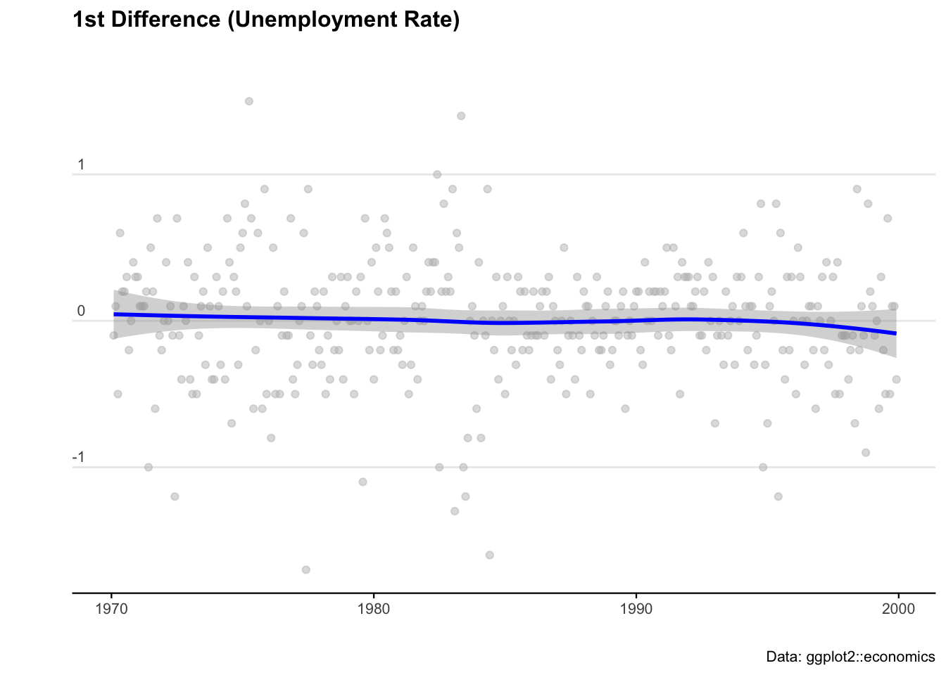
When working with ARIMAs, we need to ‘difference’ our series to make it stationary.
We check if it is stationary using the augmented Dickey-Fuller test. The null hypothesis assumes that the series is non-stationary. A series is said to be stationary when its mean, variance, and autocovariance don’t change much over time.
# Test for stationarity
aTSA::adf.test(econ_data$uempmed)
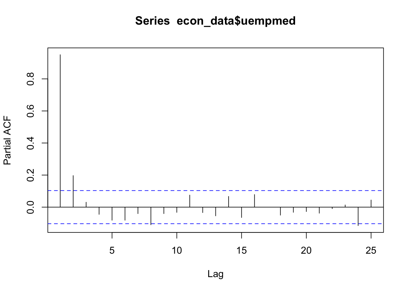
# See the auto correlation
acf(econ_data$uempmed)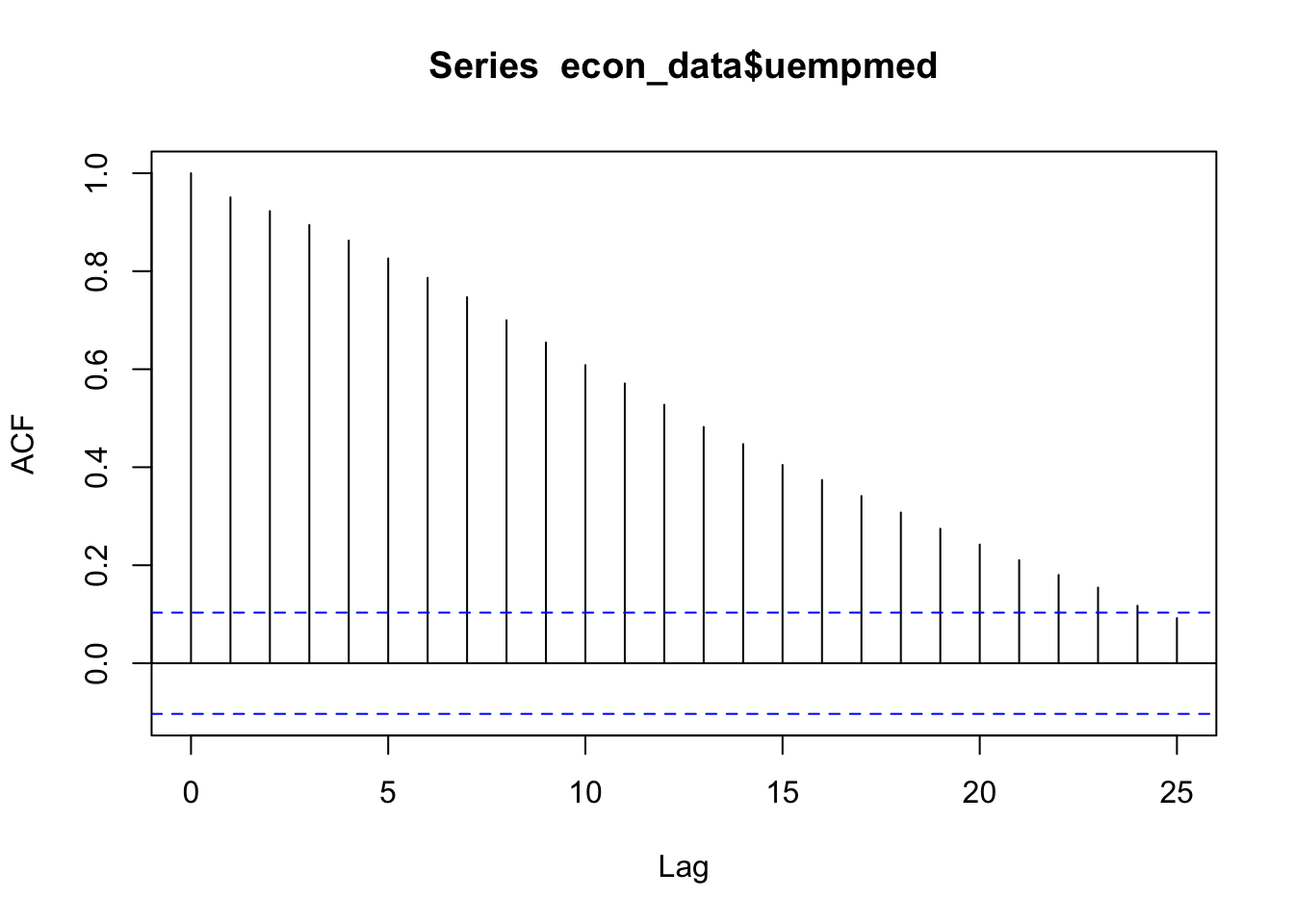
# Take the first differences of the series
econ_data <- econ_data %>% mutate(diff = uempmed - lag(uempmed))

# Plot the first differences
ggplot(econ_data, aes(x = date, y = diff)) +
  geom_point(col = "grey", alpha = 0.5) +
  geom_smooth(col = "blue") +

  labs(
    title = "1st Difference (Unemployment Rate)",
    caption = "Data: ggplot2::economics",
    x = "",
    y = ""
  ) +

  theme_minimal() +
  theme(
    legend.position = "bottom",
    plot.title = element_text(face = "bold", size = 12, margin = ggplot2::margin(0, 0, 25, 0)),
    plot.subtitle = element_text(size = 11),
    plot.caption = element_text(size = 8),
    axis.text = element_text(size = 8),
    axis.title.y = element_text(margin = ggplot2::margin(t = 0, r = 3, b = 0, l = 0)),
    axis.text.y = element_text(vjust = -0.5, margin = ggplot2::margin(l = 20, r = -10)),
    axis.line.x = element_line(colour = "black", size = 0.4),
    axis.ticks.x = element_line(colour = "black", size = 0.4),
    panel.grid.minor = element_blank(),
    panel.grid.major.x = element_blank()
  )
# Fit an ARIMA model
ARIMA_model <- forecast::auto.arima(econ_data$uempmed)

# Display model summary and residual diagnostics
summary(ARIMA_model)
forecast::checkresiduals(ARIMA_model)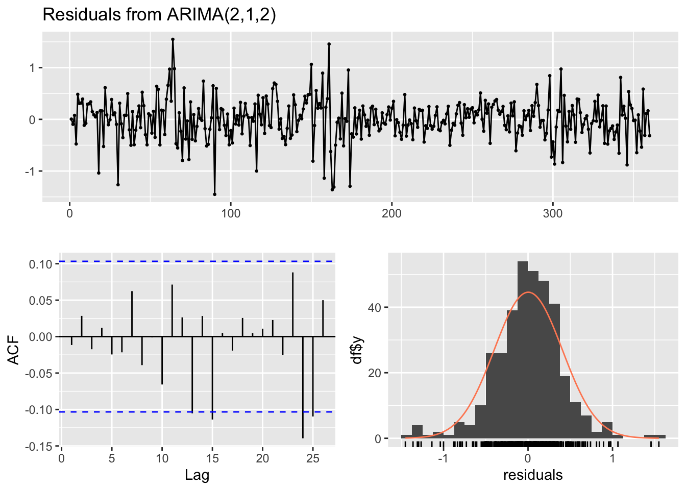
# Forecast for the next 36 time periods
ARIMA_forecast <- forecast::forecast(ARIMA_model, h = 36, level = c(95))

# Plot the forecast
plot(ARIMA_forecast)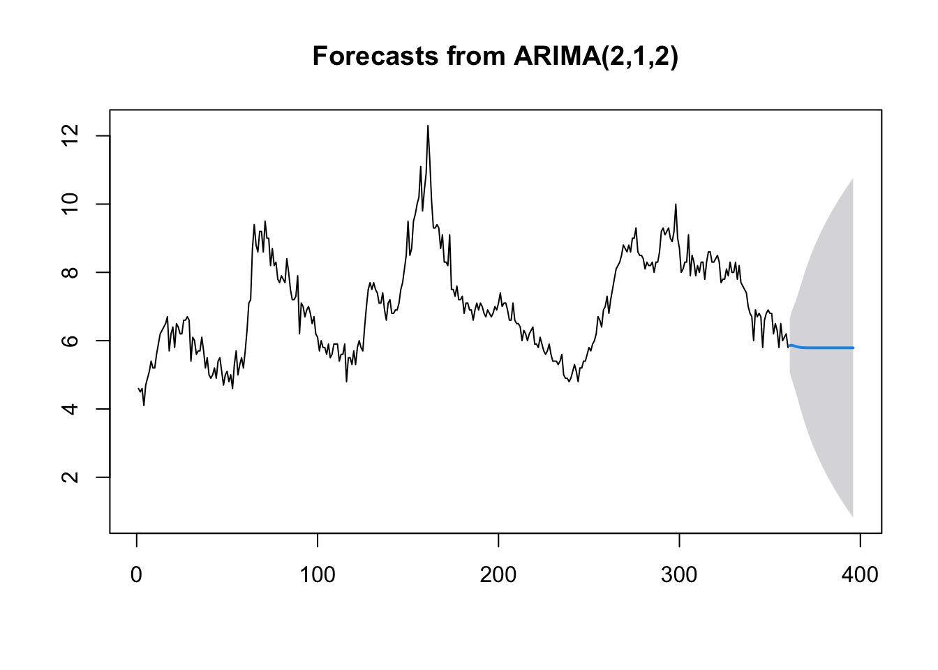
6.2 Machine learning
There probably isn’t a hotter term this decade than ‘machine learning’. But the principles of getting machines to be able to perform an operation based on an unknown input has been around for the best part of 100 years. ‘Figure it out’ is now an instruction you can tell a computer… and sure enough with some careful programming (and a truckload of data to conduct trial and error experiments on) - we can get pretty close.
I used these handy resources when writing this guide:
We’ll start our ML journey by loading some packages.
if (!requireNamespace("pacman", quietly = TRUE)) install.packages("pacman")
pacman::p_load(
  ggplot2, caret, skimr, RANN, randomForest, gbm, xgboost,
  caretEnsemble, C50, caTools
)
We know that a model is just any function (of one or more variables) that helps to explain observations. The most basic models to explain a data set are mean, min, and max. These functions don’t rely on any variables outside of the variable of interest itself.
Moving to the slightly more abstract, we recall that a linear regression fits a straight line through a data set that minimizes the variance (i.e. the errors) between each point and the model line.
To fit a linear regression, we use the lm() function in the following format:
linear_model <- lm(y ~ x, dataset)
To make predictions using mod on the original data, we can call the predict() function:
predict_data <- predict(linear_model, dataset)
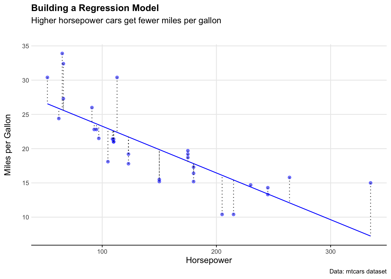
# Let's use the mtcars dataset as an example

# Fit a model to the mtcars data
data(mtcars)

# Build a linear model to explain mpg using hp
mtcars_model <- lm(mpg ~ hp, mtcars)

# Run the model over the data
mtcars_model_estimates <- predict(mtcars_model,mtcars)

# Bind the original figures for mpg with the predicted figures for mpg
mtcars_model_outputs <- cbind(Actual_mpg=mtcars$mpg,
                              Actual_hp=mtcars$hp,
                              Predicted_mpg=mtcars_model_estimates,
                              Residuals=resid(mtcars_model),
                              Fitted=fitted(mtcars_model))

# Ensure the outputs are a df
mtcars_model_outputs <- as.data.frame(mtcars_model_outputs)
We can see how well this model estimated the dataset by looking at the residuals on a plot.
ggplot(mtcars_model_outputs) +
  geom_line(aes(x = Actual_hp, y = Predicted_mpg), color = "blue") +
  geom_point(aes(x = Actual_hp, y = Actual_mpg), color = "blue", alpha = 0.5) +
  geom_segment(aes(x = Actual_hp, y = Actual_mpg, xend = Actual_hp, yend = Fitted),
               color = "black", alpha = 0.8, linetype = "dotted") +

  labs(
    title = "Building a Regression Model",
    subtitle = "Higher horsepower cars get fewer miles per gallon",
    caption = "Data: mtcars dataset",
    x = "Horsepower",
    y = "Miles per Gallon"
  ) +

  theme_minimal() +
  theme(
    legend.position = "bottom",
    plot.title = element_text(face = "bold", size = 12),
    plot.subtitle = element_text(size = 11, margin = ggplot2::margin(b = 25)),
    plot.caption = element_text(size = 8),
    axis.text = element_text(size = 8),
    axis.title.y = element_text(margin = ggplot2::margin(r = 3)),
    axis.text.y = element_text(margin = ggplot2::margin(l = 10)),
    axis.line.x = element_line(color = "black", size = 0.4),
    axis.ticks.x = element_line(color = "black", size = 0.4),
    panel.grid.minor = element_blank()
  )
To quantify the model fit in a single number, we can use the Root Mean Square Error (RMSE).
# Manually calculate RMSE
error <- mtcars_model_outputs$Actual_mpg - mtcars_model_outputs$Fitted
mtcars_rmse_manual <- sqrt(mean(error^2))

# Alternative: Using Residuals column directly
mtcars_rmse_residuals <- sqrt(mean(mtcars_model_outputs$Residuals^2))

# Print results
print(mtcars_rmse_manual)
print(mtcars_rmse_residuals)
So in very rough terms, we can say that the model predicts miles per gallon for a given level of horsepower with around 4 mpg of error.
6.3 Random forest
True ‘machine learning’ takes this process a step further by creating many models using many parameters to find the best explanatory variables. There’s a myriad of ways to achieve this. One useful approach is Random Forest models. These algorithms combine decision trees (discussed below) to make predictions.
In this section, we will use the Boston dataset from the MASS package to predict house prices using machine learning models. The dataset contains information on housing prices in the Boston area, with various predictors such as crime rate, number of rooms, and property tax rates. The target variable medv represents the median value of owner-occupied homes in $1000s.
We will first split the dataset into training and testing sets, train a Random Forest model, evaluate its performance, and then compare it with a linear regression model using tidymodels.
# Load necessary libraries
library(MASS)
library(caret)

# Load the Boston housing dataset
data("Boston")

# Splitting the dataset into training (80%) and testing (20%) sets
set.seed(123)
train_index <- createDataPartition(Boston$medv, p=0.8, list=FALSE)
train_data <- Boston[train_index, ]
test_data <- Boston[-train_index, ]

# Display the first few rows of each dataset to confirm the split
head(train_data)
head(test_data)
We will now train a Random Forest model using the randomForest package. The algorithm builds multiple decision trees and averages their predictions to improve accuracy and reduce overfitting.
# Train a Random Forest model with 100 trees
model <- randomForest::randomForest(medv ~ ., data=train_data, ntree=100)

# Make predictions on the test set
predictions <- predict(model, test_data)
We use Root Mean Square Error (RMSE) to measure the model’s performance as we did in the previous section.
# Calculate RMSE
rmse <- sqrt(mean((predictions - test_data$medv)^2))

# Print RMSE result
print(paste("RMSE:", round(rmse, 2)))
To compare performance of our randomForest model, we train a simple linear regression model using the tidymodels framework. Linear regression attempts to fit a straight line that best represents the relationship between predictors and the target variable.
# Load necessary library
library(tidymodels)

# Set a seed for reproducibility
set.seed(123)

# Define a linear regression model
ml_model <- linear_reg() %>%
  set_engine("lm") %>%
  set_mode("regression")

# Create a workflow that includes the model and the formula
tidymodels_workflow <- workflow() %>%
  add_model(ml_model) %>%
  add_formula(medv ~ .)

# Train the linear regression model
trained_model <- tidymodels_workflow %>% fit(data = train_data)
After training the model, we can use it to make predictions on the test_data. The predict() function returns predicted values, which are then combined with the actual test data for comparison.
The metrics() function calculates various performance metrics, such as RMSE, MAE, and R², to evaluate the model’s predictive accuracy. The truth argument specifies the actual values (medv), and the estimate argument specifies the predicted values (.pred).
# Make predictions using the trained model
predictions <- predict(trained_model, test_data) %>% bind_cols(test_data)

# Evaluate model performance using metrics function
metrics(predictions, truth = medv, estimate = .pred)
As we see, our randomForest model performed much better, with a RMSE of 2.96 compared to 4.58.